Cards
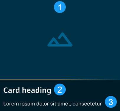
The Eureka cards group related content in an organized container. Each card has a unique topic or action. The purpose of our cards is to be:
- Modular: They are ready-made and flexible, so you can use them in many ways.
- Groupable: Our cards are meant to group like items or topics in rows of 2 or more cards.
- Focused on one topic: Each card should cover one topic.
- Scalable: you can use cards in most of our design system’s patterns.
Live demo
Coming soon.
Anatomy
THE CODE BASE FOR CARDS IS CHANGING. THIS SECTION IS OUT OF DATE AND INCOMPLETE.
maybe a uland maybe not.li, the card container.div, that contains headings, content, anchor, and image.new-code-coming-soon.

Usage
Do
- Use to create a visual hierarchy.
- Promote top tasks.
Don't
- Use buttons in interactive cards.
- Center text. It goes against accessibility, usability, and design best practices.
Developer notes
| Tags, attributes, classes | Description |
|---|---|
ca-grid |
|
ca-card |
|
.ca-card |
|
Accessibility
| Element or property | Description |
|---|---|
|
|
|
|
Changelog
| Date | Version | Affects | Notes |
|---|---|---|---|
| MM/DD/YYYY | 0.0.0.0 | Something | This is the first release. |